Overview
What is CRMLS Paragon?
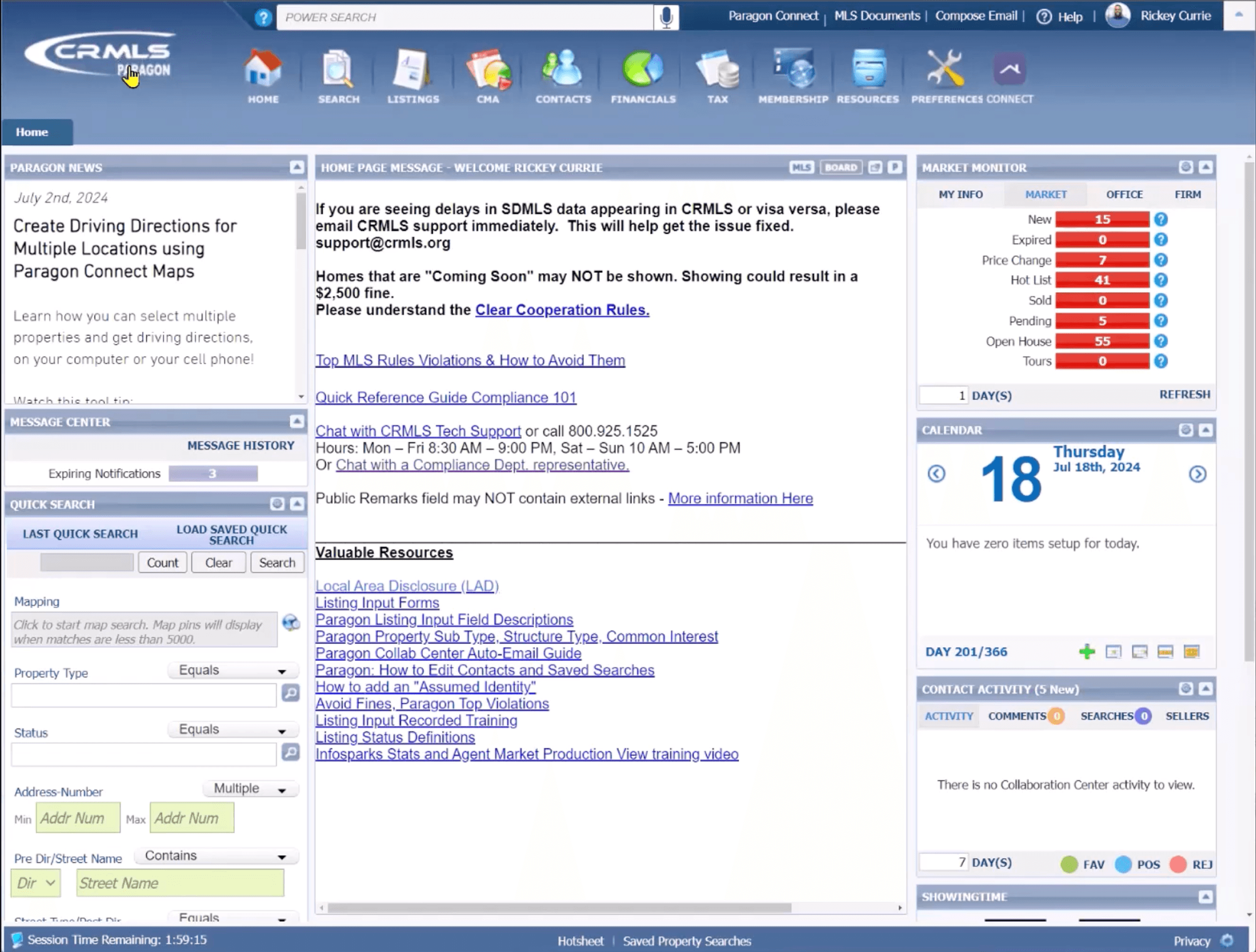
Homepage
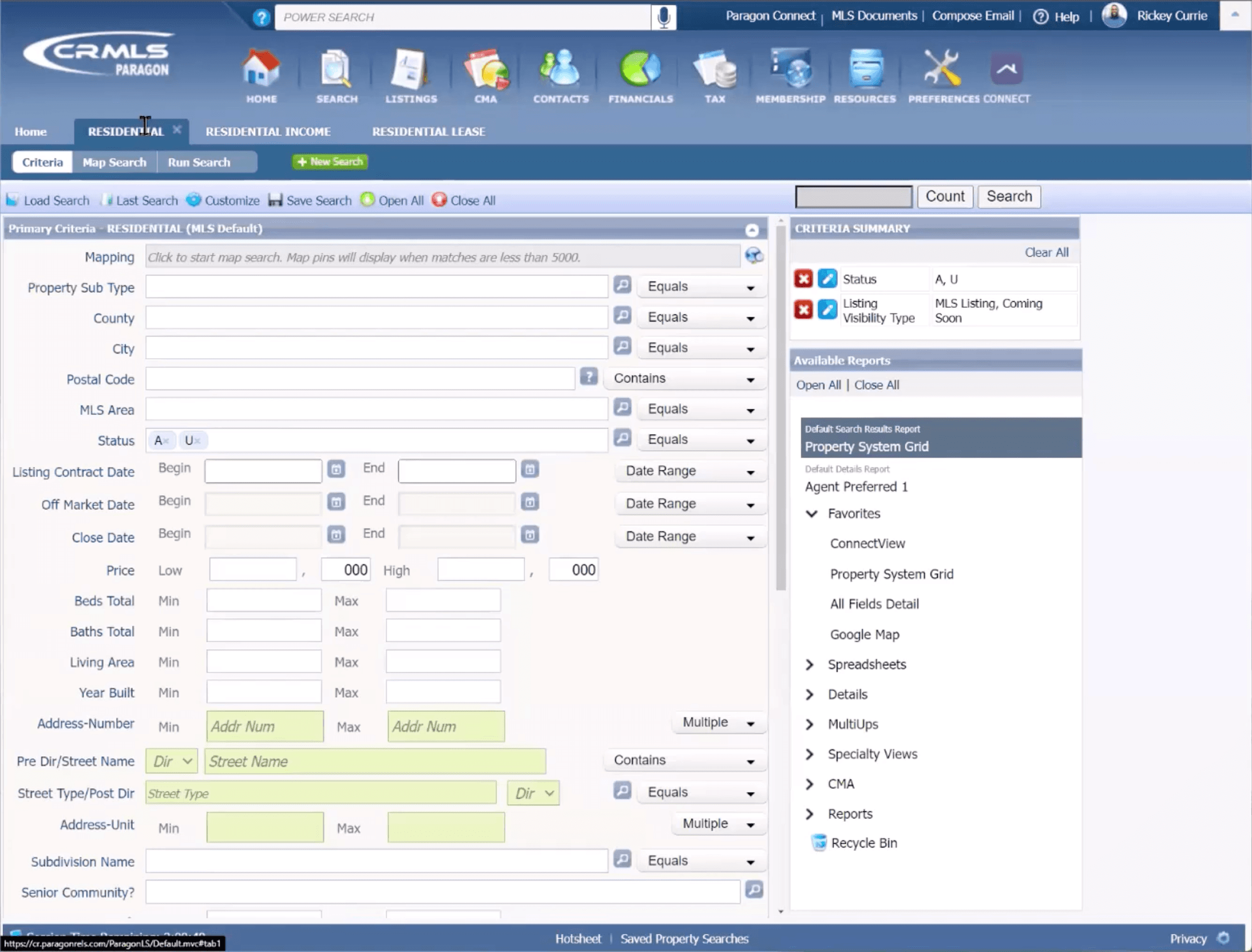
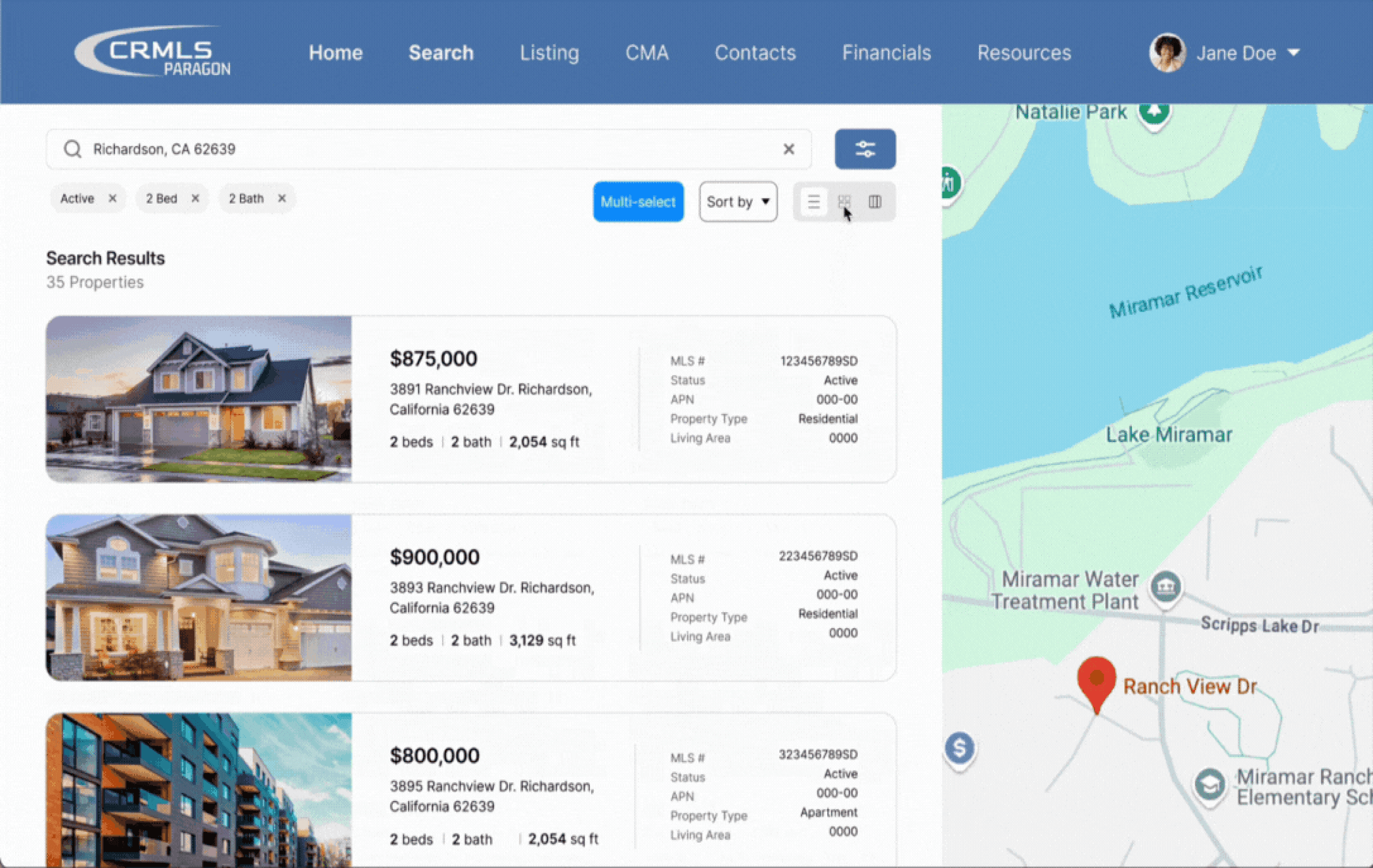
Filters/Search Page
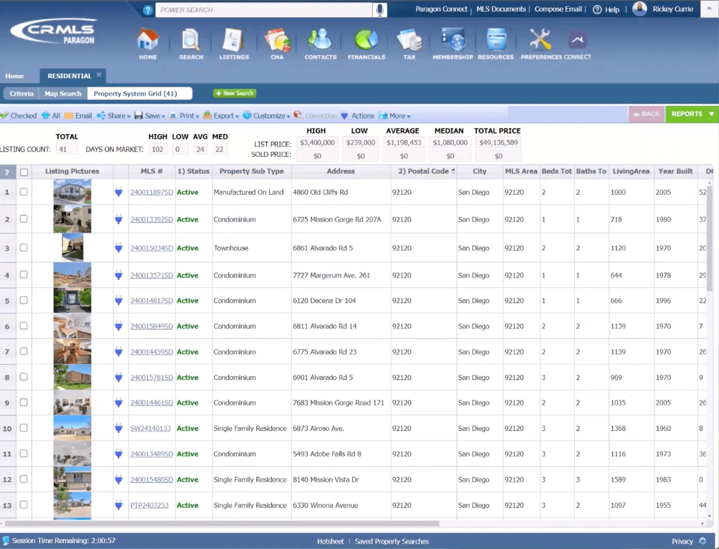
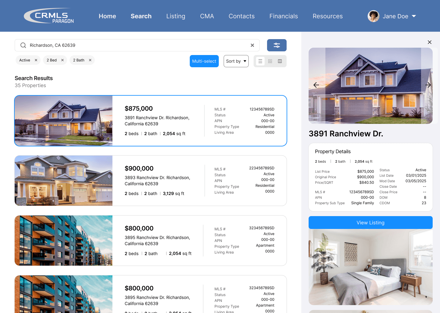
Property Listings Page
Problem
The current property search process is time-consuming and prevents agents from building their client base and providing adequate attention to existing customers.
Real estate agents need a way to quickly identify and compare relevant properties for their clients.
Our Solution
A revamped experience that focuses on visual hierarchy and readability to increase efficiency. Our goal was to ensure that agents do not have to spend more time than necessary when searching for properties.
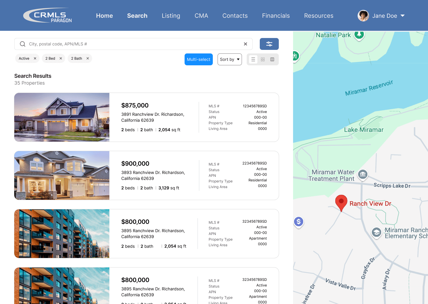
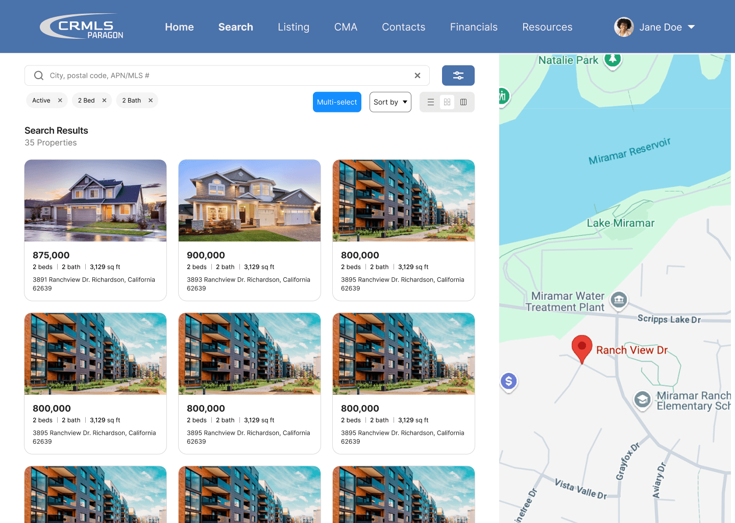
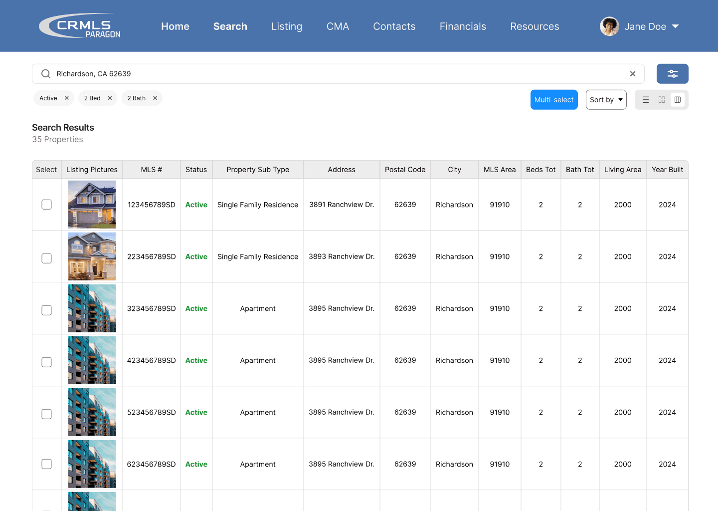
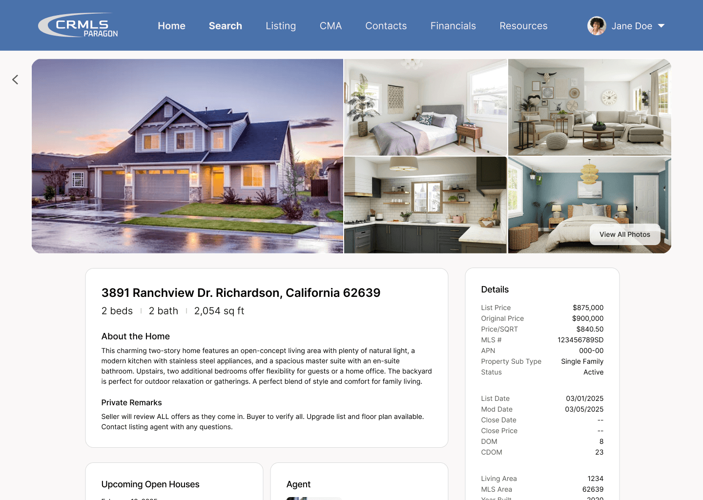
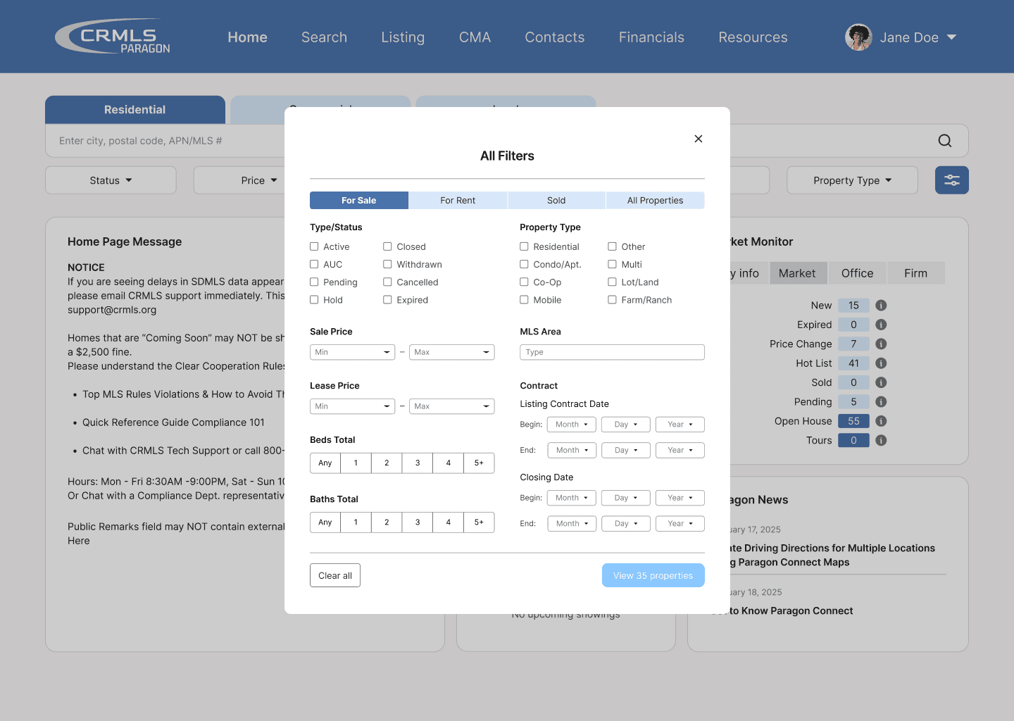
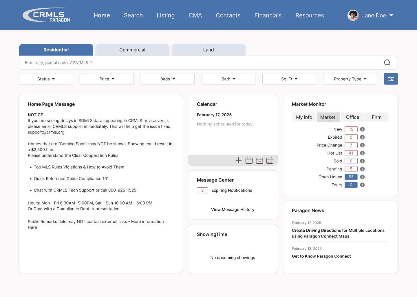
Key Features
Homepage
Convenient Searching
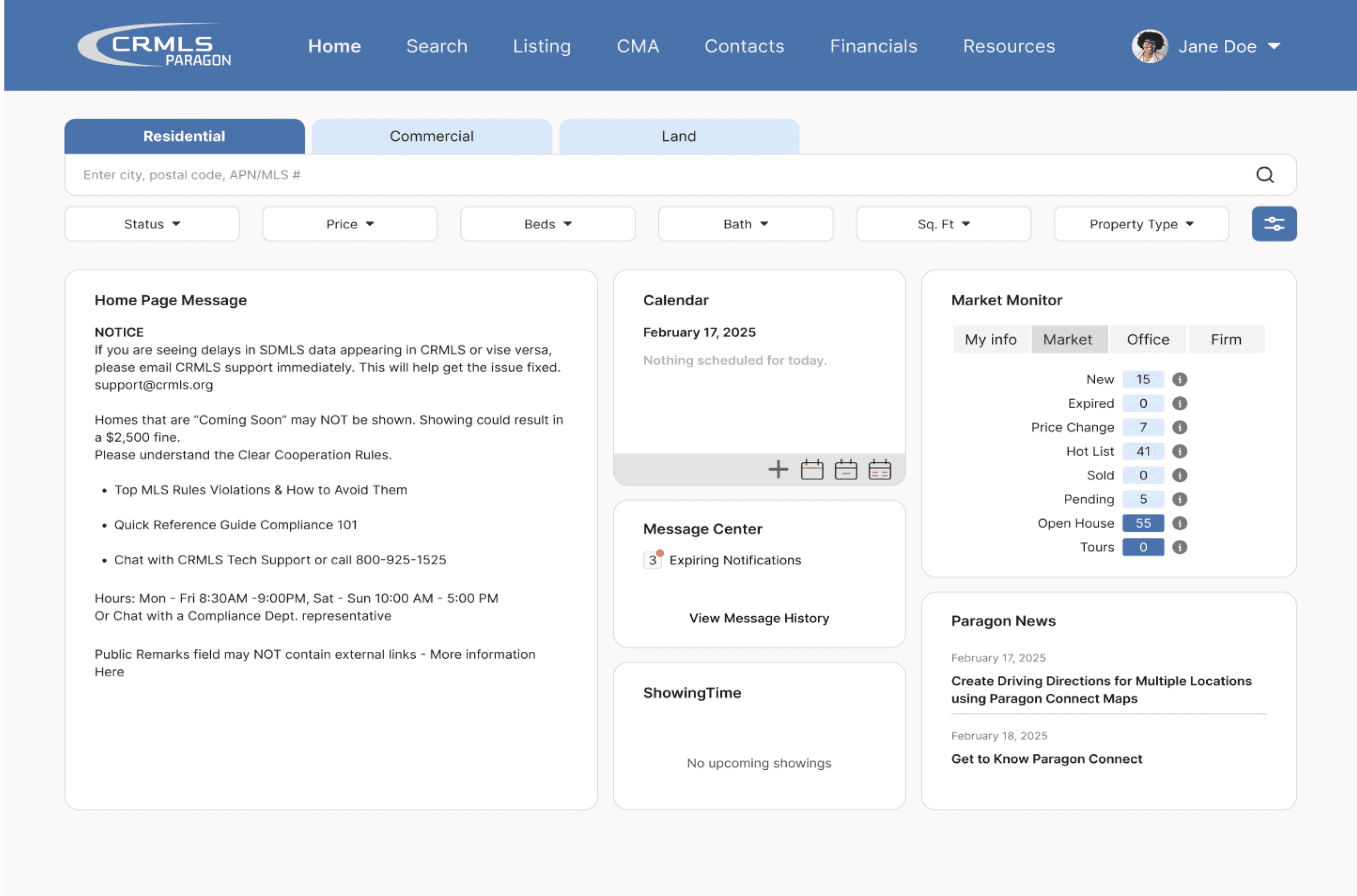
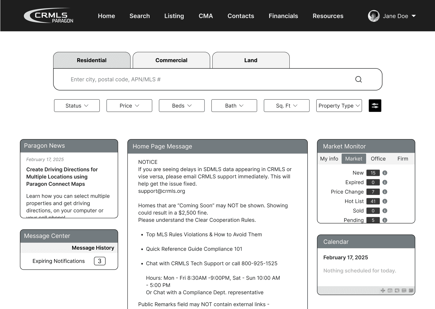
Discovering that the most sought out feature of the platform was the property search, we implemented a search bar onto the homepage. This change provides a quicker and more evident entry point.



The Process
Methods
Our interview questions were curated to...
learn about our client’s daily tasks and the tools they use
gain context on their work
identify challenges with those tools
pinpoint areas of friction
understand their ideal solutions
reveal what matters most to them
Our goal with this framework was to encourage discussions that highlight our stakeholders’ frustrations, ensuring we focused on real, existing problems.

Key Findings: User Pain Points
1
Even experienced agents struggle to navigate the program’s cluttered interface.
The absence of clear visual hierarchy and logical information architecture contributes to this clutter, making it difficult for agents to find specific filters or perform tasks efficiently.
2
Key Information is difficult to read.
Text and image elements lack sufficient size, spacing, and contrast, making it difficult for agents to scan and comprehend quickly. As a result, they spend more time deciphering what they see than actually searching for what they need.
3
Throughout the application, users are often left feeling stuck.
When users select the “Checked” button in the top toolbar, unselected properties disappear from view. Although a button to return to all properties is available, its low visual prominence and proximity to other tools make it easy to overlook. This lack of discoverability causes users to feel stuck and not in control.
How might we improve the property search experience for real estate agents to easily and efficiently find homes for their clients?
Ideation
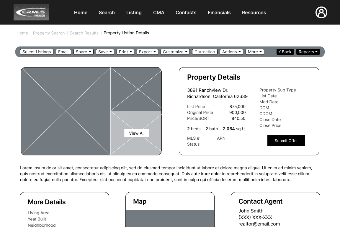
We started with developing two distinct prototypes, varying in layouts and feature functionalities.
Prototype 1
Features:
Commonly used filters are placed at the top of the filters page
Text-based filters were replaced with preset options
The search bar stays visible for quick adjustments
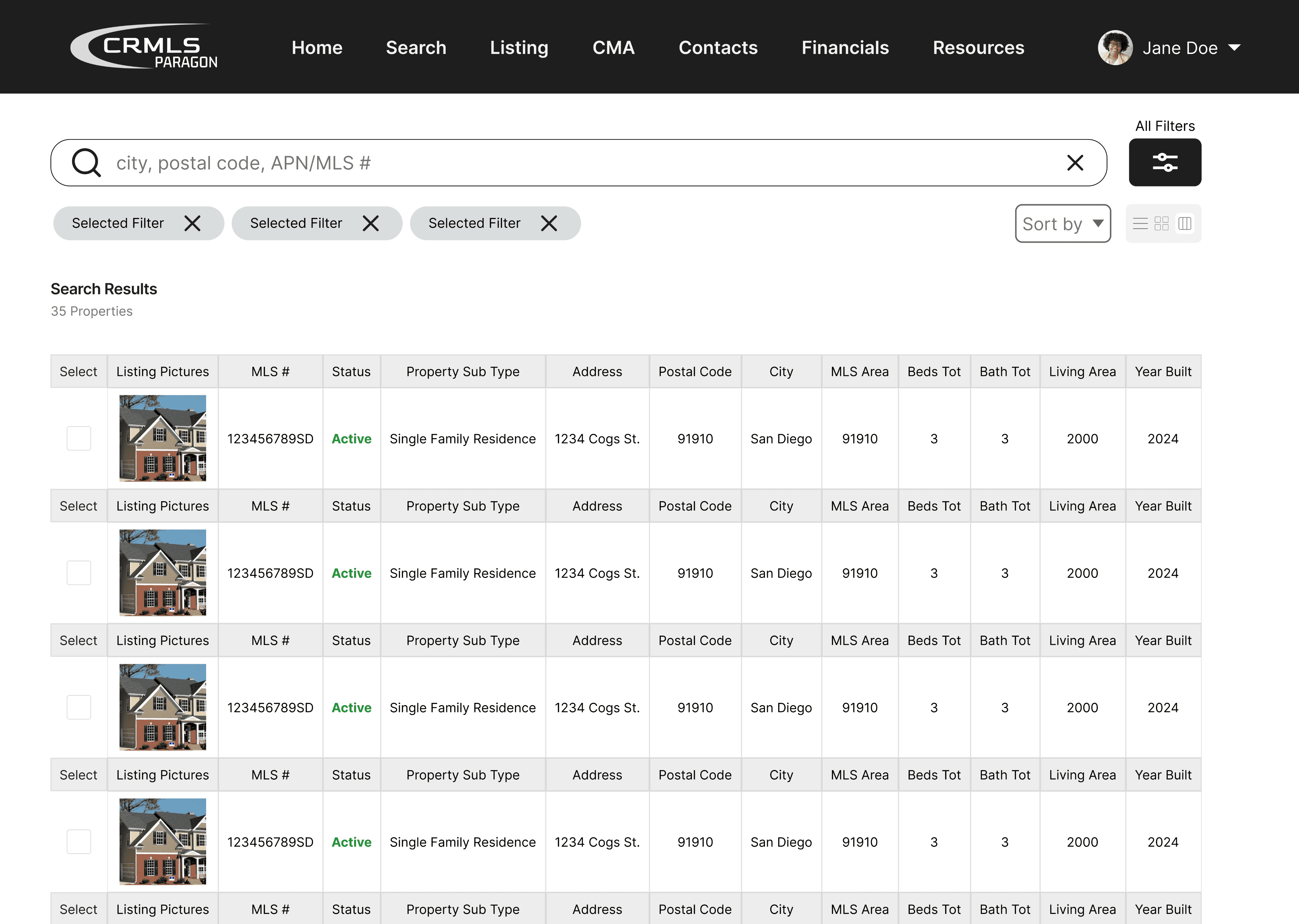
Multiple viewing options are available on listings page
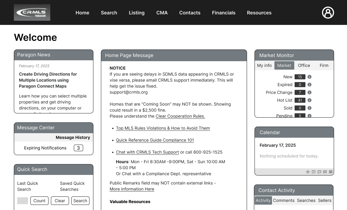
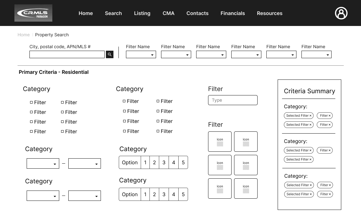
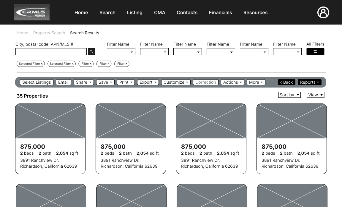
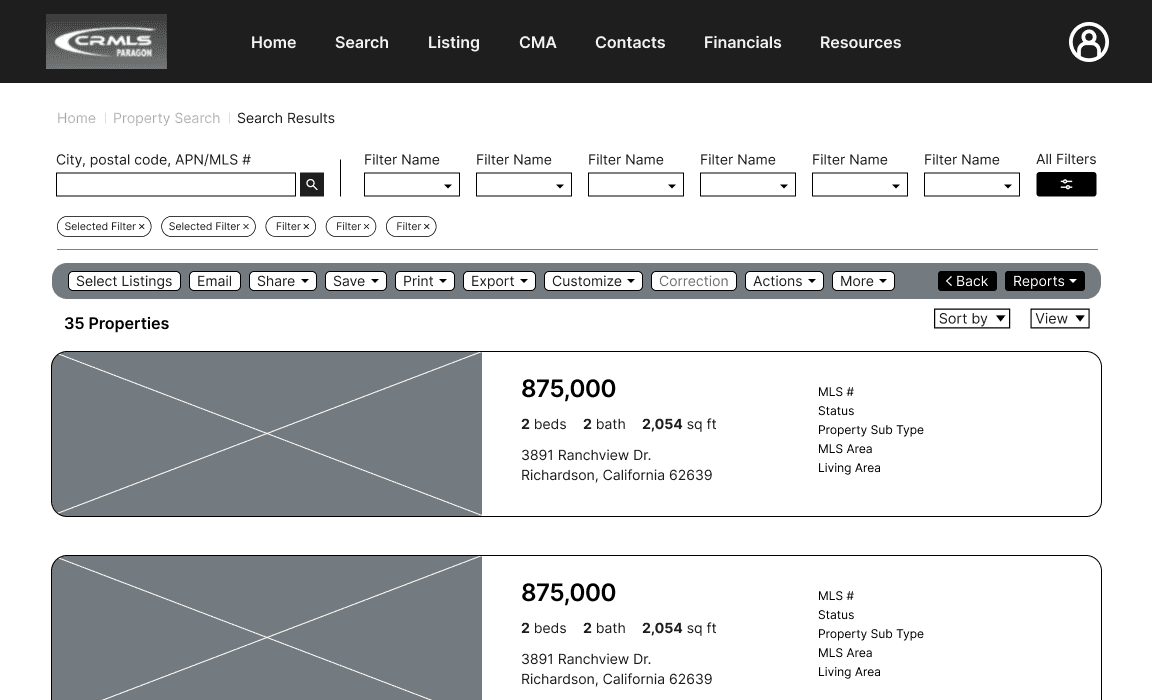
Prototype 2
Features:
Search bar is accessible on homepage
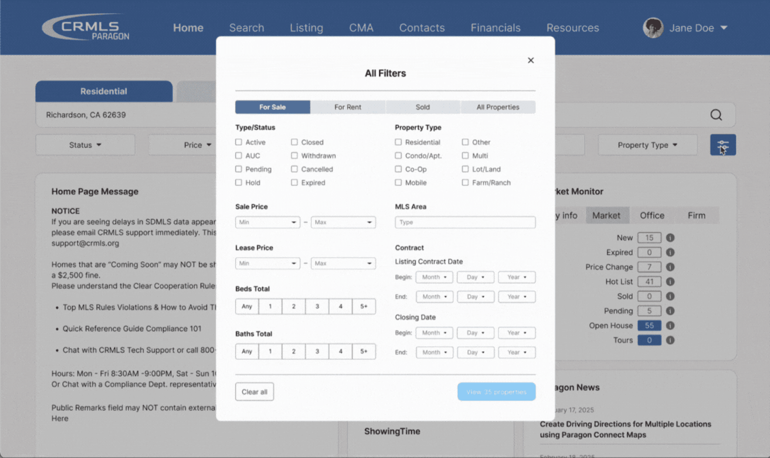
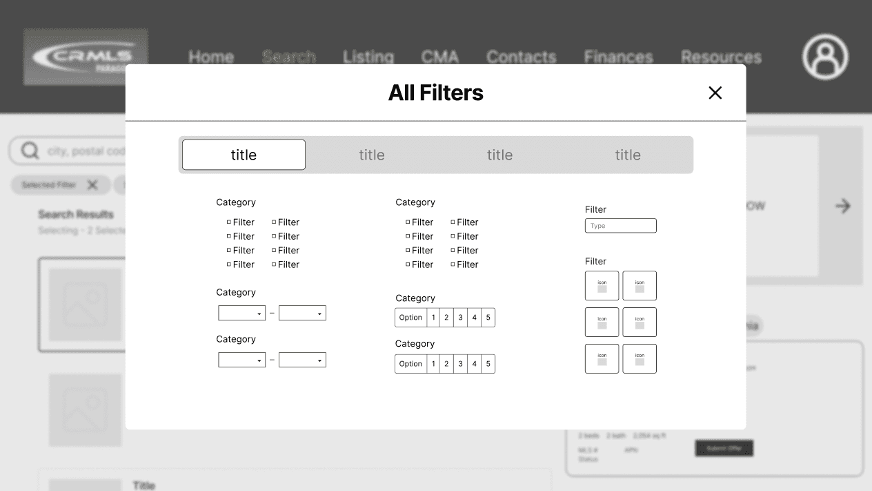
Popup filter screen
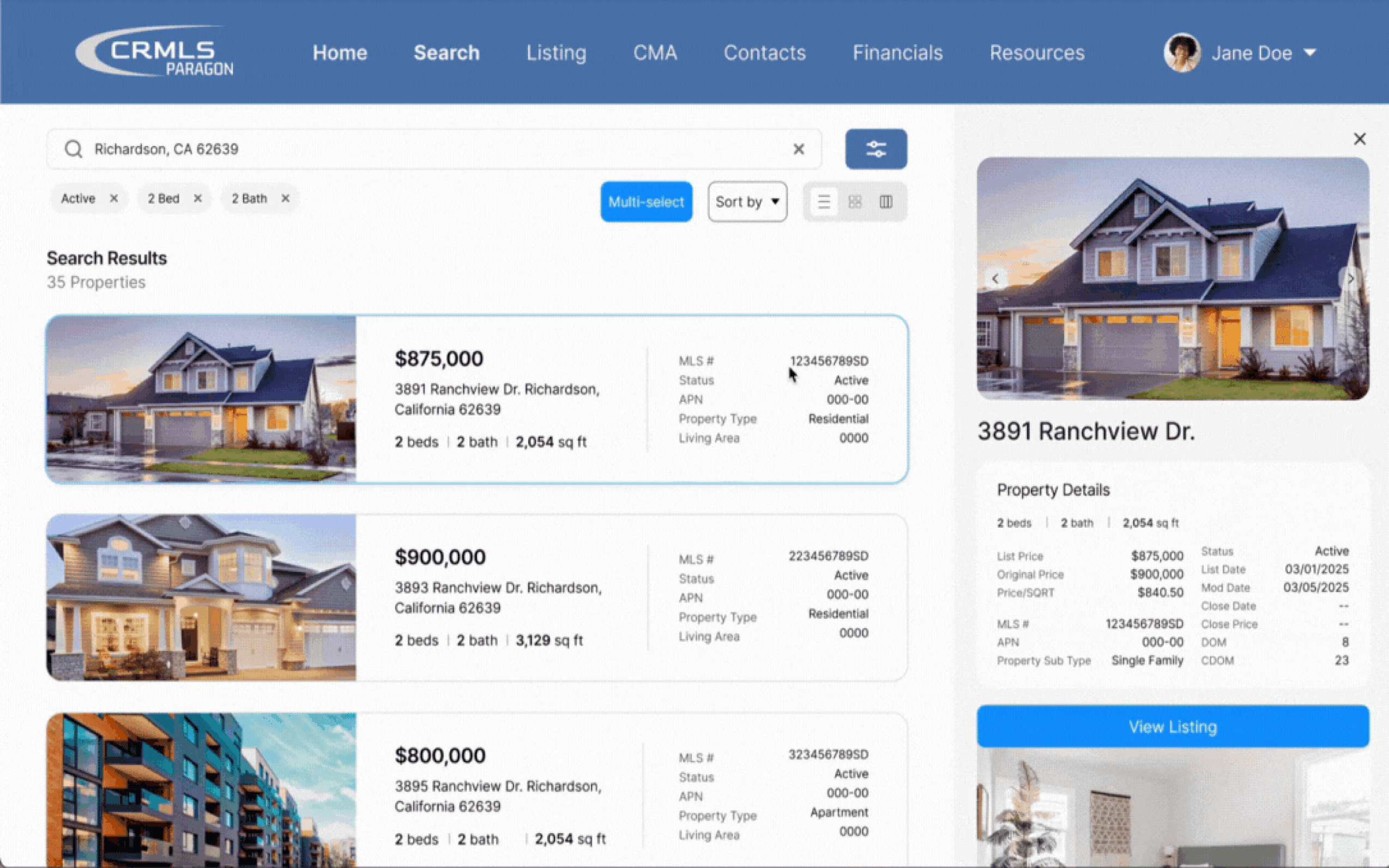
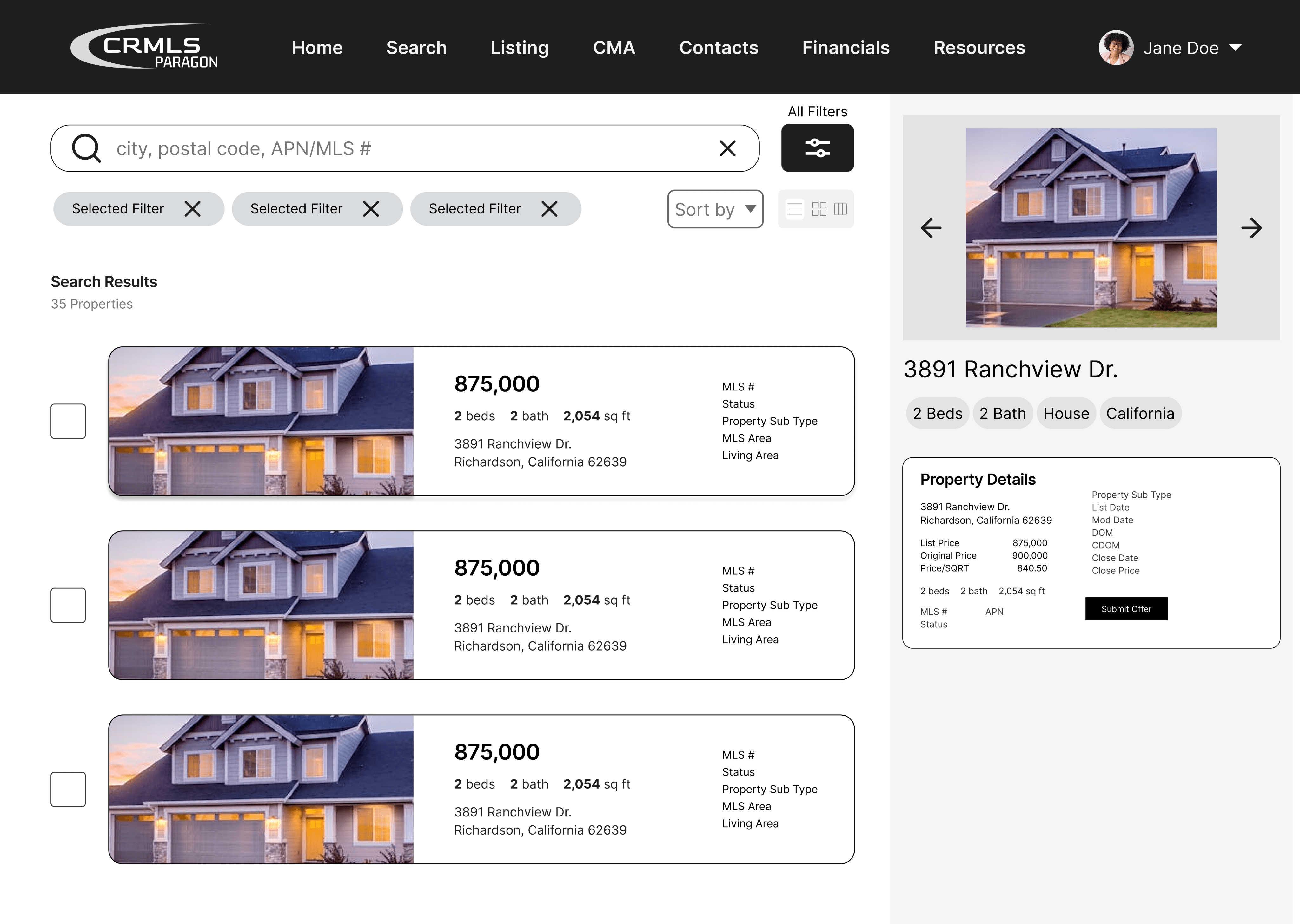
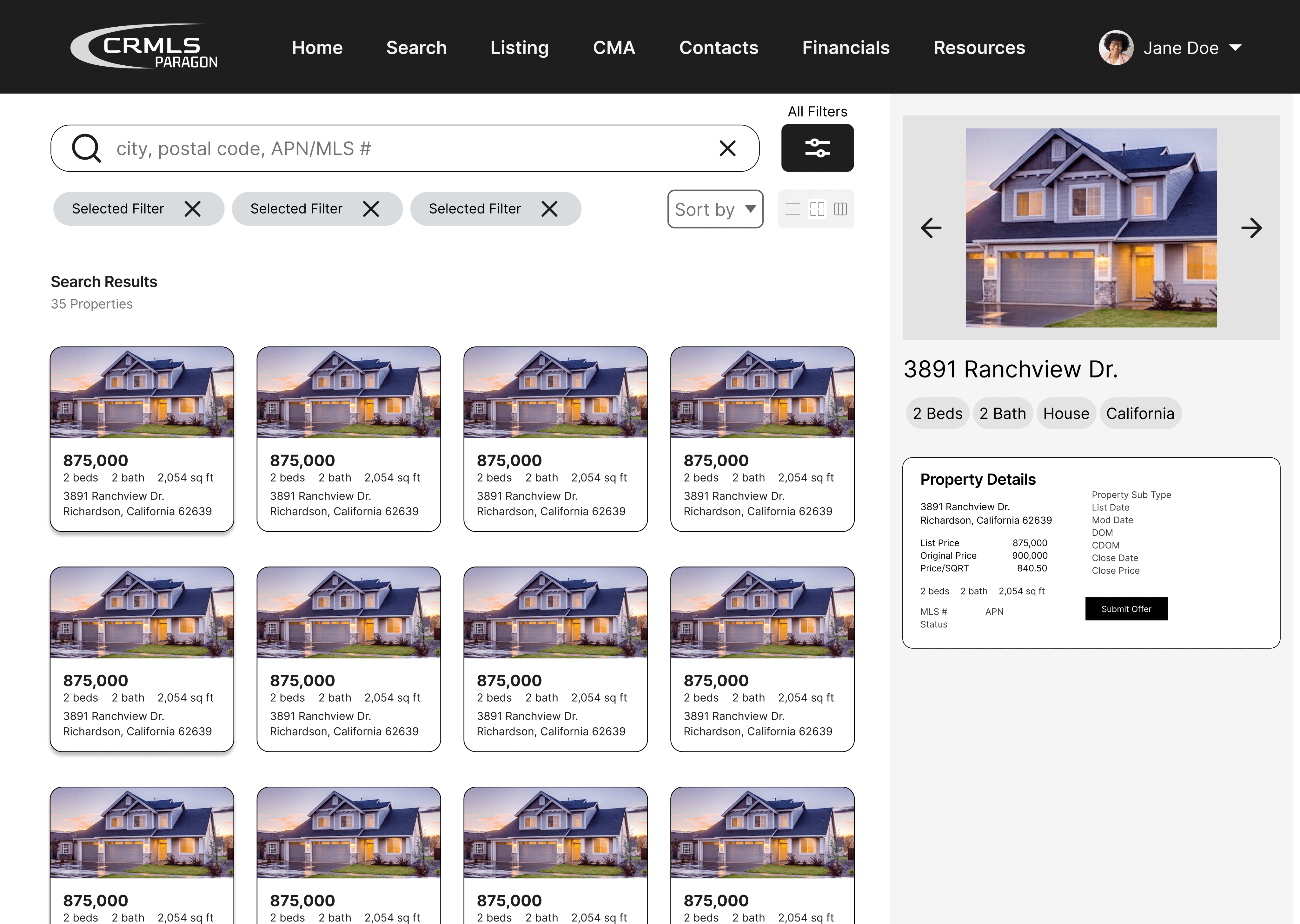
Split-screen layout to view results and details simultaneously
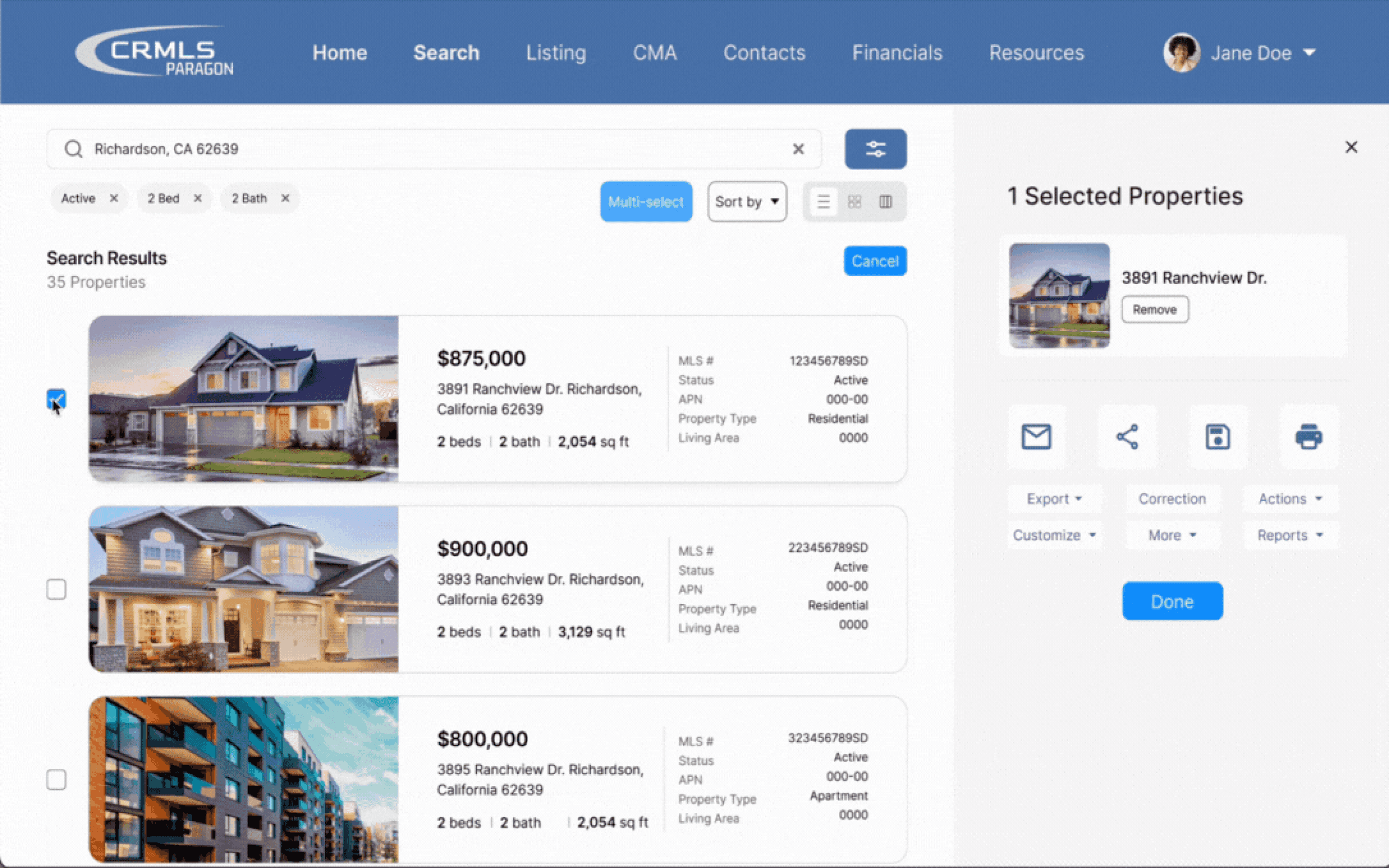
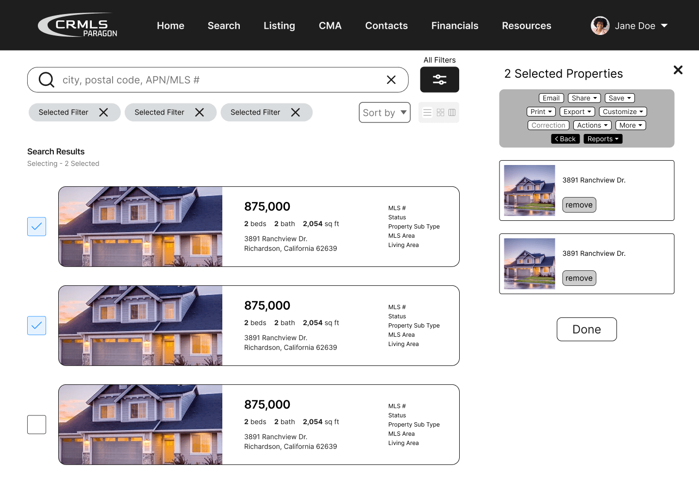
Reconfiguration of select feature
Homepage

Filters
Listings
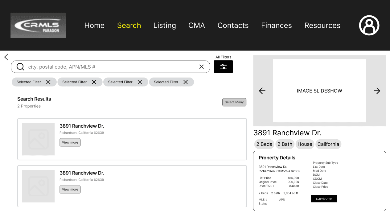
Preview Listing
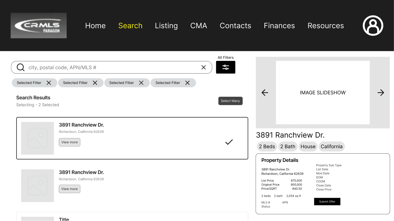
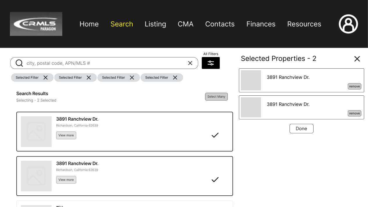
“Select Many”
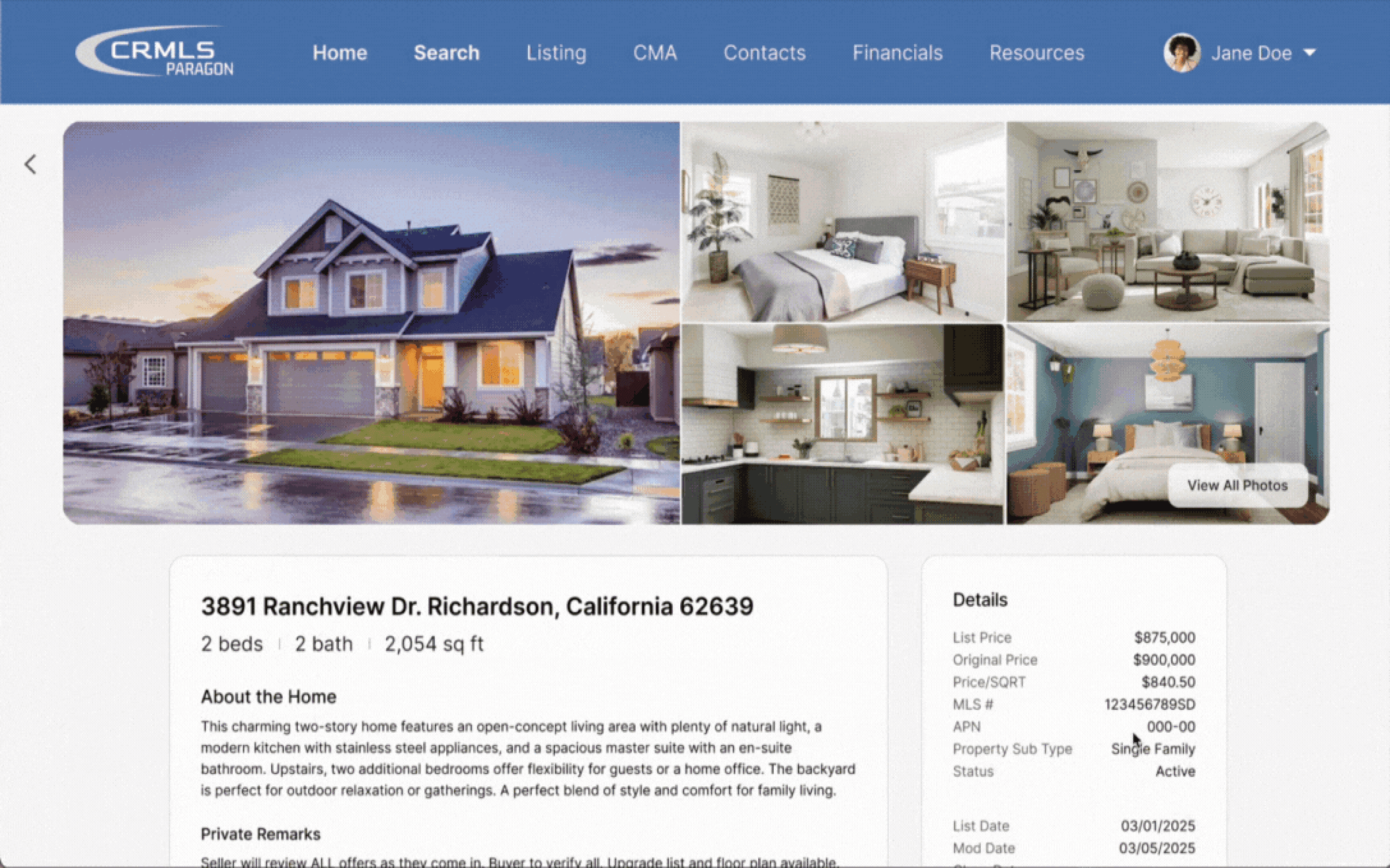
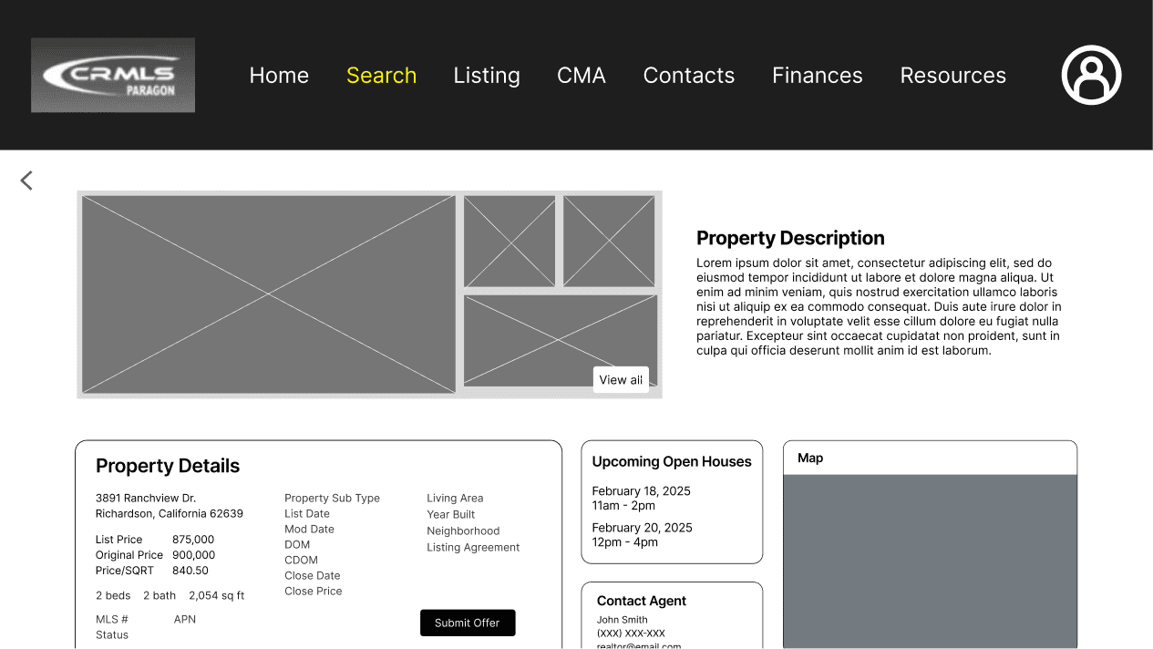
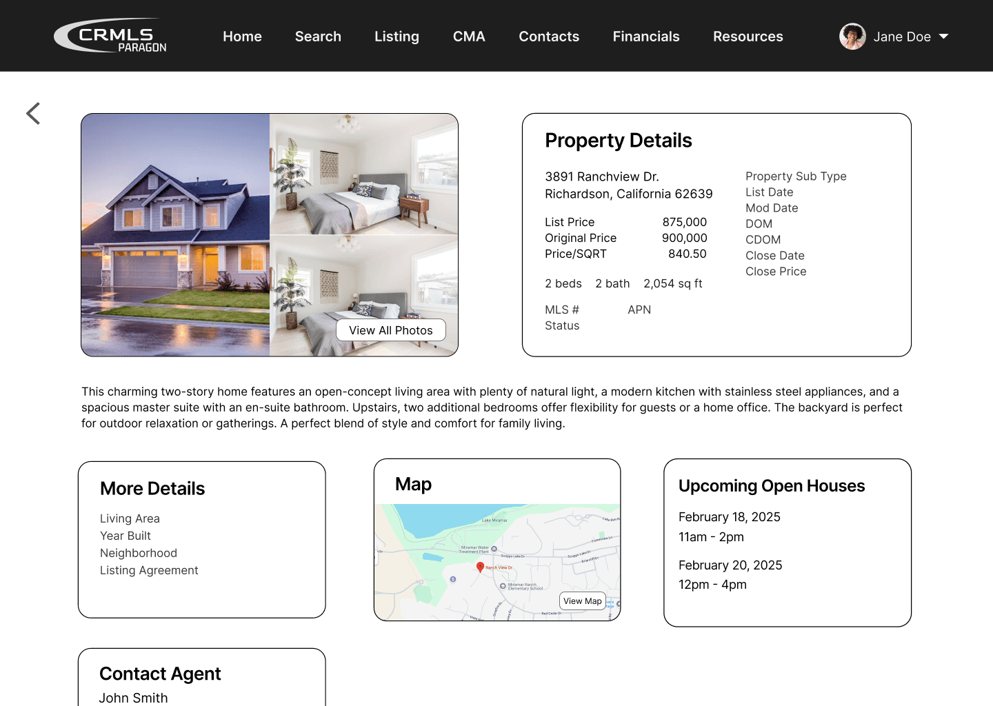
Property Details
User Feedback 1
We reached out to our original stakeholder and an additional real estate agent to gather insight on whether our ideas effectively address the challenges they face.
Prototype 1
multiple viewing options
card layout allows more listings to be visible
property details are easy to understand
filters are overwhelming
text is too small
Prototype 2
search bar is accessible on homepage
popup filters are digestible
“select many” button is not automatically understandable
text is too small
50/50 split preference between the two prototypes
Users suggested a column view and map feature
Mid-Fidelity Wireframes
With these comments in mind, our mid-fidelity prototype built upon Prototype 2, while bringing back preferred features from Prototype 1.
relocated search bar to the homepage
displayed filters as a popup format
implemented the ability to switch between listing views and select multiple properties feature
simplified property details layout
User Feedback 2
After another round of feedback from stakeholders, TAs, and peers, exposed issues with spacing, contrast, and layout inconsistencies.
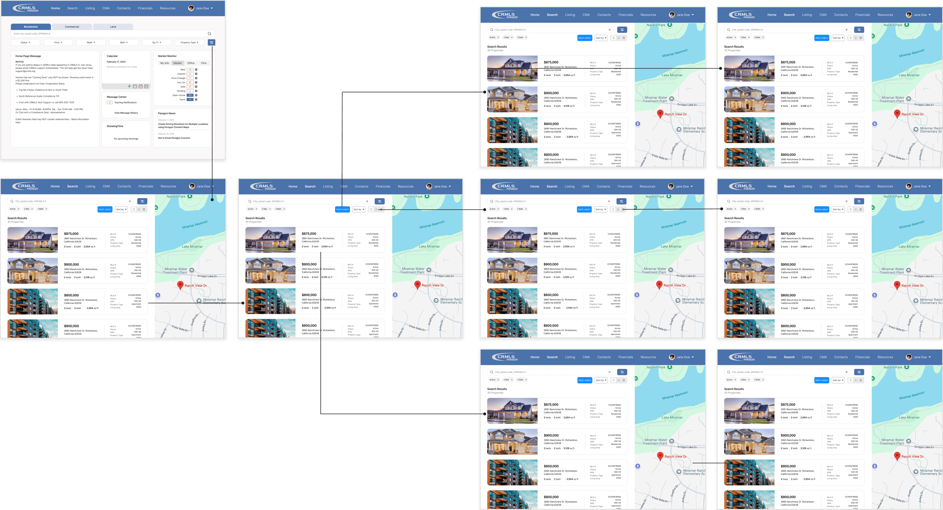
For our final iteration, we focused on refining the details and aimed to improve the clarity of the app's visual design.
High-fidelity User Journey
Reflection
This experience taught me how to collaborate effectively and maintain consistent communication with a real-world client. The project was structured around weekly checkpoints, which helped my team and I learn to work within constraints and meet deadlines efficiently. With more time, I would have interviewed additional real estate professionals throughout the process to gather broader insights and further inform our design decisions.